FUNNY GRAFFITI
FUNNY GRAFFITI TORONTO
|
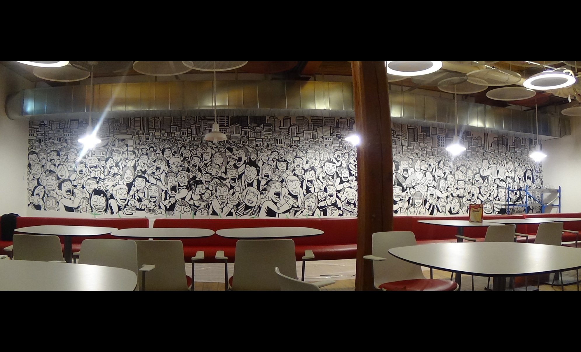
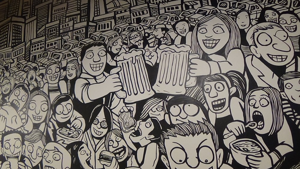
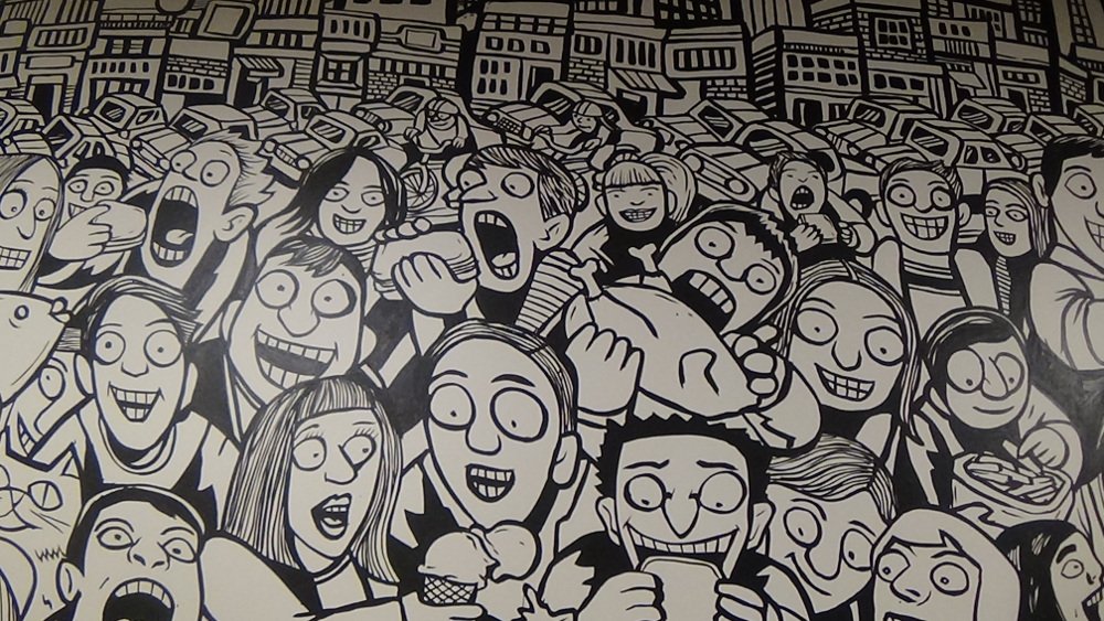
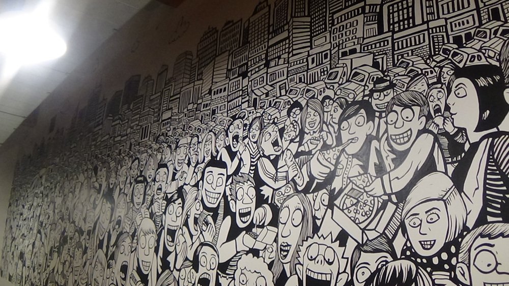
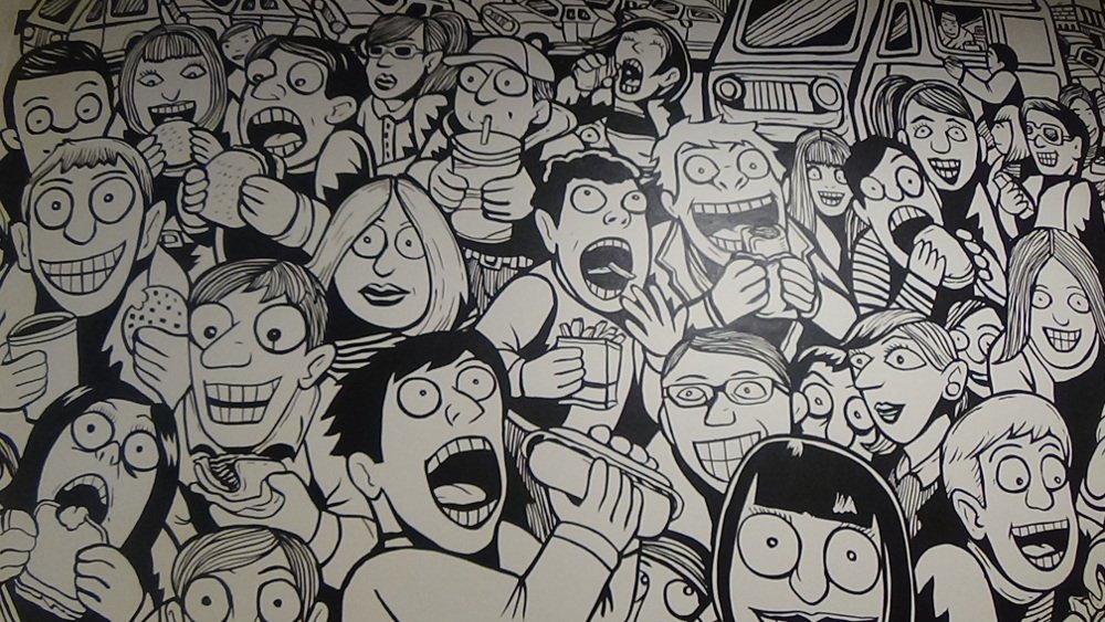
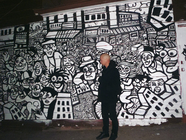
Funny Graffiti Murals! This giant lunchroom mural features a wide assortment of crazy characters feasting on comically over sized drumsticks, pizza slices and gigantic pints of beer. The silly lunchtime scenario takes place on the streets of Toronto with several iconic buildings visible in the background and numerous food trucks, cafes and restaurants lining the street level storefronts. The work was commissioned for the common space lunchroom of the Critical Mass new media office in Toronto. The space is multifunctional and used daily for meals as well as group events, business meetings and presentations. The concept behind the work was to create something humorous that was filled with all sorts of tiny details so that each time the office employees look at it they could discover something new. One interesting aspect of the project was trying to find a way to please as many people as possible with the work. The office is shared by a lot of different people working in various areas of social media. The workers represent a number of differing age groups, cultural niches and backgrounds so expressing diversity and the use of comedic images was integral to the piece. In order to do this I made sure to include a wide variety of ethnicity in both the characters and the types of food. To make the drawing funny I exaggerated a lot of the character's expressions such as bulging eyeballs and maniac smiles as they gorge on the meals. The size and type of the food was also grossly exaggerated as one person can be seen chomping on an oversized whole tuna fish. I also added a number of animals sneaking around looking for food including a cat stealing some sushi from an unsuspecting couple. The entire mural spanned approximately 30 feet long by 6 feet high with a few small details hiding up behind the vent shaft. I put a few clouds and helicopters up at the top which aren't visible from the main floor but make the mural would look more complete when people were sitting directly below it. Prior to installation the company held a few brainstorming sessions to get their ideas together and I provided about five sketches for them to choose from. The sketches basically showed various degrees of silliness and a few different ratios between the amount of people in the crowd as compared to the size of the skyline. They eventually decided on a 70% crowd 30% buildings ratio and opted for the most exaggerated and silly version of the characters. With these preparations in place it was very easy to do the work. I drew the mural free hand directly onto the wall using artist quality black acrylic paints and the entire installation took less 5 days to complete. |
RELATED PAGES
